

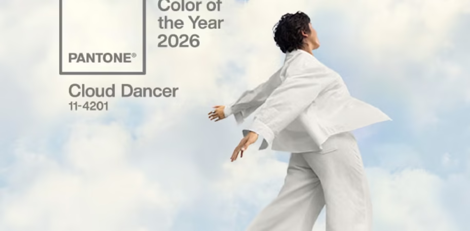

Every year, the Color of the Year 2026 sets the tone for creative industries worldwide. For 2026, Pantone’s selection reflects evolving cultural values, emotional needs, and visual preferences. It is more than a trend. It represents a collective mindset shaped by global change, creative expression, and the desire for balance in a complex world.
What Is the Color of the Year and Why It Matters?
The Color of the Year 2026 is chosen through extensive research by the Pantone Color Institute. They study global influences such as art, fashion, technology, travel, and social behavior. According to Pantone, color trends mirror cultural conversations and emotional shifts.
As Pantone shared in its Instagram announcement, the Color of the Year 2026 reflects calm, clarity, and creative reset. It encourages designers to adopt softer and more thoughtful visual expressions. Therefore, creators worldwide use this selection as a guide for aesthetics and storytelling.
The Deeper Meaning of the Color of the Year 2026
The Color of the Year 2026 highlights a global preference for simplicity and emotional grounding. According to Vogue, contemporary color trends are moving away from visual overload. Instead, designers favor tones that create comfort, openness, and mental ease. People increasingly seek visuals, spaces, and experiences that feel calming and purposeful.
This trend emphasizes the importance of emotional wellbeing and mindful creativity in modern design.
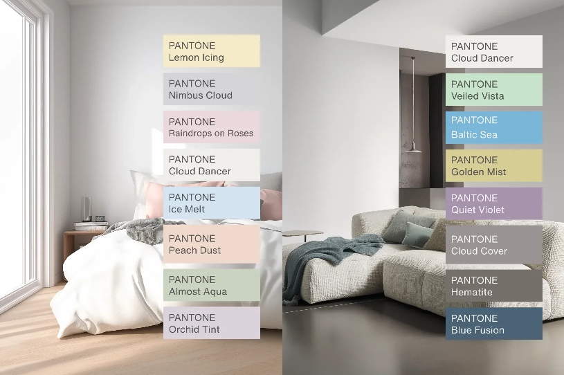
Global Influence
The Color of the Year 2026 impacts more than just design. It shapes branding, packaging, digital media, and lifestyle products. According to The Economic Times, this color aligns with global movements focused on balance, sustainability, and conscious living. Consequently, its announcement sparks discussions and adoption across creative industries.
Why it Matters for Design Education
Studying color trends helps students connect theory with real-world design. At INSD Trivandrum, students analyze global color movements to strengthen visual awareness and conceptual clarity.
Through structured education and hands-on projects, students learn how color choices affect perception, emotion, and communication. By understanding trends like the Color of the Year 2026, they gain insight into how design evolves alongside culture.
Color of the Year 2026 as a Creative Conversation
The Color of the Year 2026 is more than aesthetics. It opens discussions about how design responds to social change and emotional needs. Whether viewed as a symbol of calm, renewal, or clarity, this color reflects a broader desire for intentional creativity.
Understanding the rationale behind Pantone’s selection helps designers and students appreciate color as a powerful communication tool.
The Color of the Year 2026 captures a world that values balance, simplicity, and emotional connection. As global design conversations evolve, color continues to influence how ideas are expressed and experienced.
At INSD Trivandrum, students explore such global design narratives to stay inspired, informed, and creatively prepared for the future.
